Color Psychology: Using Hue to Shape Mood at Home
Ever walked into a room and felt instantly relaxed or a little on edge? That’s color psychology at work. The shades you pick for walls, sofas, and accents can lift spirits, calm nerves, or even spark creativity.
First, think about the feeling you want in each space. Do you need a calm retreat after a long day? Or a lively kitchen that inspires cooking experiments? Matching the vibe to the room’s purpose makes the whole house feel intentional.
Living Room: Balance Comfort and Energy
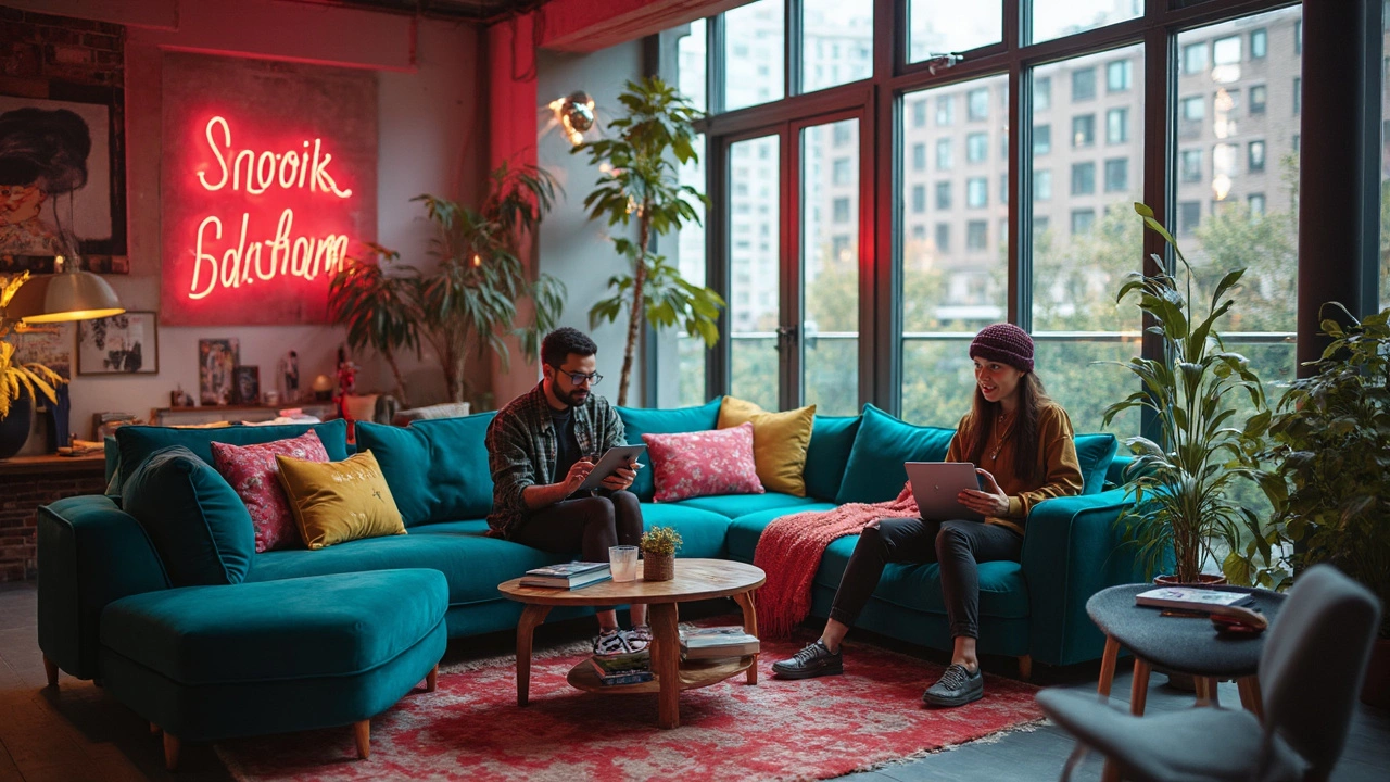
Soft blues and muted greens are great for a living room you use for unwinding. These cool tones lower heart rate and promote conversation without overwhelming the senses. Pair a blue sofa with a light‑gray rug and you’ve got a calm backdrop for movie nights or a coffee catch‑up.
If your living room doubles as a family hub, add a splash of warm orange or sunny yellow in throw pillows or artwork. Warm hues boost optimism and encourage interaction, perfect for games or family gatherings.
Bedroom: Create a Restful Sanctuary
Bedrooms thrive on soothing colors. Lavender, pale pink, or gentle taupe can signal the brain to wind down. Avoid bright reds or neon greens; they raise alertness levels, making it harder to drift off.
Even small changes matter. Swap a bold poster for a pastel‑tinted lamp shade, and notice the difference in how quickly you feel sleepy.
Kitchen and dining areas benefit from colors that stimulate appetite and conversation. Reds and deep oranges are classic choices—they’re proven to make food look more appealing and encourage chatter over meals.
For a modern twist, try a teal backsplash with white cabinets. The teal adds excitement without feeling chaotic, and it pairs nicely with natural wood tables for a balanced look.
Home office spaces need focus‑friendly tones. Light gray, soft beige, or a muted sage keep distractions low while still providing enough contrast for visual interest. A single accent wall in a richer shade can define the work zone without draining energy.
Don’t forget the power of neutral bases. A neutral wall color lets you switch accent hues easily as trends change or your mood shifts. It also saves money—painting a neutral wall is cheaper than redoing a bold one.
When you pick furniture, think about the material’s inherent color. Bamboo, for example, brings a natural, calming greenish tone that works well with earth‑y neutrals. Tiger‑inspired patterns can add a daring pop, but keep them limited to one or two pieces to avoid visual overload.
Lighting plays a huge role too. Natural light amplifies color, while warm LED bulbs can soften harsh hues. Test paint swatches at different times of day before committing, and watch how the same color shifts from sunrise to night.
Finally, trust your gut. If a shade feels right, it likely matches your personal mood profile. Color psychology isn’t a rigid rulebook; it’s a guide that helps you create spaces you love to live in.
Start small—add a colorful rug, switch out cushion covers, or paint a single wall. Observe how each change affects your mood and adjust accordingly. With the right hues, your home can become a daily boost for mind and body.
Gen Z Favorite Color: How It Shapes Corner Sofa Trends
Gen Z is rewriting the rules for home decor, including how they pick the color for their corner sofas. Bold choices and tech-driven preferences play a big role. This article breaks down the actual favorite colors among Gen Z and why they stand out. You'll get real tips on choosing a sofa color that feels fresh, plus a peek at how brands are responding. Learn how to style a space to reflect Gen Z’s personality without spending a fortune.
View more