Matching Furniture Colors: How to Pair Shades Like a Pro
When working with matching furniture colors, the art of pairing furniture hues so they complement each other and the room’s vibe. Also known as color coordination in furniture, it helps create a cohesive look that feels intentional rather than accidental. Matching furniture colors encompasses furniture color trends, the yearly shifts in popular palettes that influence what homeowners choose and relies on solid interior design, the broader discipline that merges function, aesthetics, and personal style. By understanding these connections, you can avoid clashing tones and achieve a space that feels balanced and inviting. The central idea is simple: match colors that share a common undertone or sit opposite on the color wheel, and you’ll instantly raise the room’s appeal.
Why Color Theory and Trends Matter
Matching furniture colors requires a grasp of basic color theory. The color wheel shows primary, secondary, and tertiary hues; complementary pairs—like blue and orange—create energy, while analogous shades—like teal and turquoise—deliver calm. Knowing which scheme suits a room’s purpose lets you decide whether you want a vibrant conversation starter or a soothing retreat. Current furniture color trends, such as muted earth tones, deep navy, and pastel greens, provide a ready-made palette that many designers already test. When you align your choices with these trends, you benefit from proven combinations that have been vetted in showrooms and real homes alike. Moreover, trends influence material finishes; for example, bamboo pieces often showcase natural honey tones that pair well with charcoal or crisp white. This connection highlights how sustainable material choices intersect with color decisions, making it easier to pick pieces that feel both stylish and environmentally responsible.
Practical tips take the theory into action. Start by selecting a dominant color—usually the sofa or major piece—and then build around it. Use accessories like cushions, throws, or rugs to introduce secondary hues without overwhelming the base. Look for undertone matches: a warm walnut table works best with warm-toned upholstery, while cool gray walls harmonize with steel or glass accents. Lighting also plays a role; natural light can shift colors throughout the day, so test swatches at different times. Finally, don’t forget texture; a matte finish can mute a bold shade, whereas a glossy surface amplifies it. Below you’ll find a curated list of articles that dive deeper into each of these aspects, from ergonomic sofa choices to the hottest color palettes of 2024, giving you a toolbox to master matching furniture colors in any space.
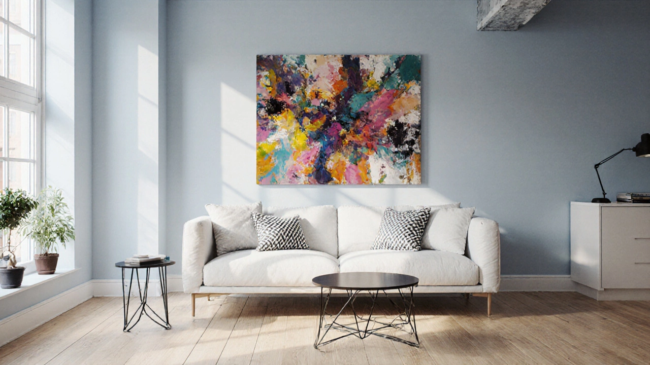
Timeless Furniture Colors That Match Any Decor
Discover the universal furniture colors that match any décor, learn how to pair them with lighting, style, and fabrics, and avoid common pitfalls for a timeless look.
View more