 11
Oct,2025
11
Oct,2025
Furniture Color Match Advisor
Find Your Perfect Neutral
Get personalized recommendations for timeless furniture colors that match your space. Answer a few quick questions about your room's lighting, desired mood, and wall color.
Choosing a paint or upholstery shade for your new piece can feel like a gamble-what if it clashes with the wall color, the rug, or the next season’s trends? The good news is you don’t need a crystal ball. Certain hues work like a blank canvas, blending effortlessly with almost any design direction. Below we break down the most reliable colors, why they get along with everything, and how to use them without ending up in a bland room.
Why "Neutral" Is the Sweet Spot
When interior designers talk about neutral furniture colors shades that sit in the middle of the color spectrum, offering flexibility to pair with a wide range of wall paints, textiles, and accessories, they’re referring to hues that carry little chroma. These colors act like a visual mute button, allowing other elements-art, pillows, or a bold rug-to take center stage. Neutrality isn’t about boring; it’s about creating a balanced backdrop that can adapt as trends shift.
The Four Universal Shades
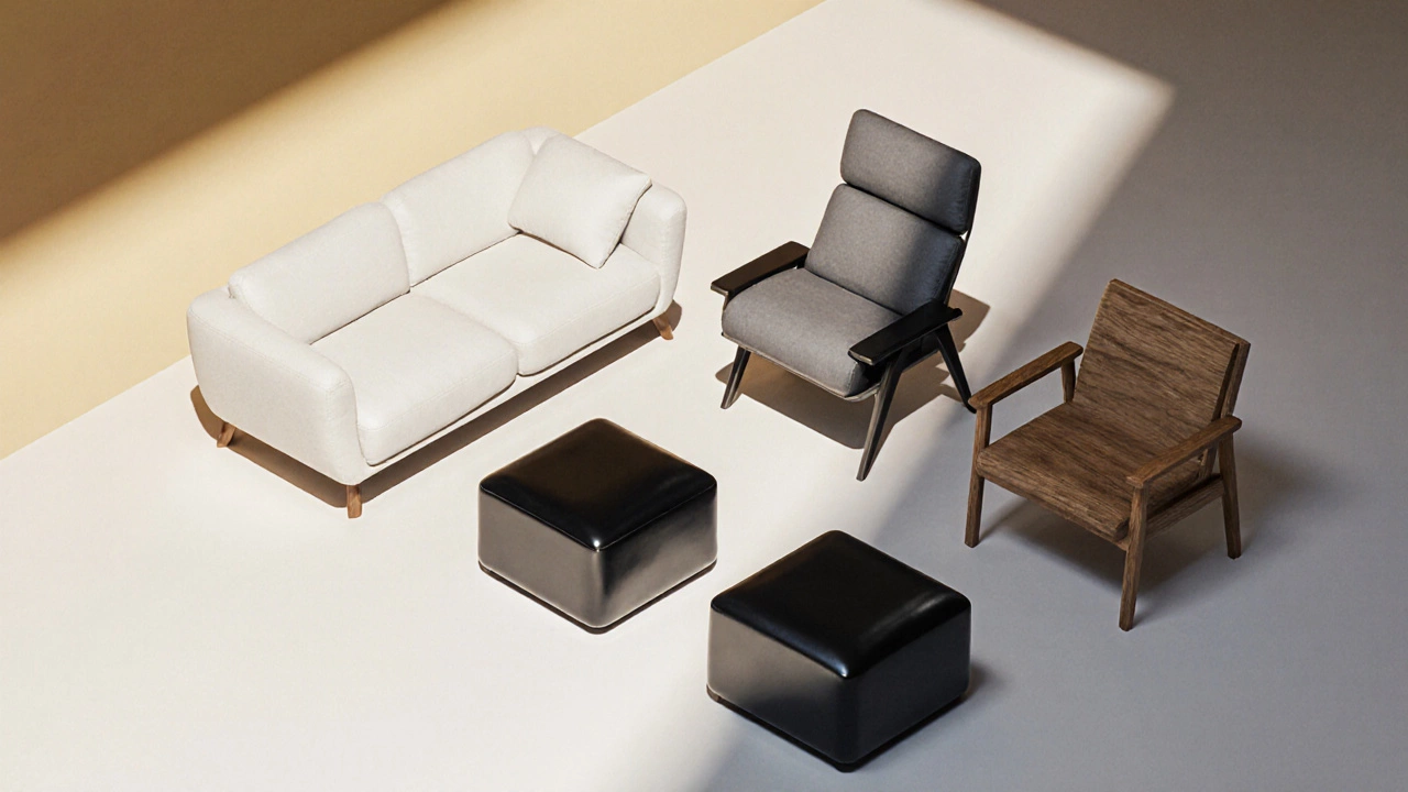
While the word “neutral” can cover a broad band, most experts boil it down to four star performers. Each has distinct attributes that make it suitable for particular lighting conditions and lifestyle needs.
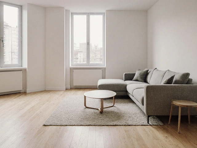
- White a crisp, reflective shade that opens up spaces and works well with high‑contrast accents
- Gray a versatile mid‑tone that can be warm or cool, offering a sophisticated backdrop for modern or traditional interiors
- Black a dramatic, grounding hue that adds depth and works surprisingly well in lighter rooms when balanced with natural light
- Natural wood the inherent color of timber-ranging from light oak to deep walnut-brings warmth and texture without overwhelming other colors
How Light Changes the Game
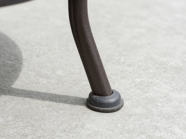
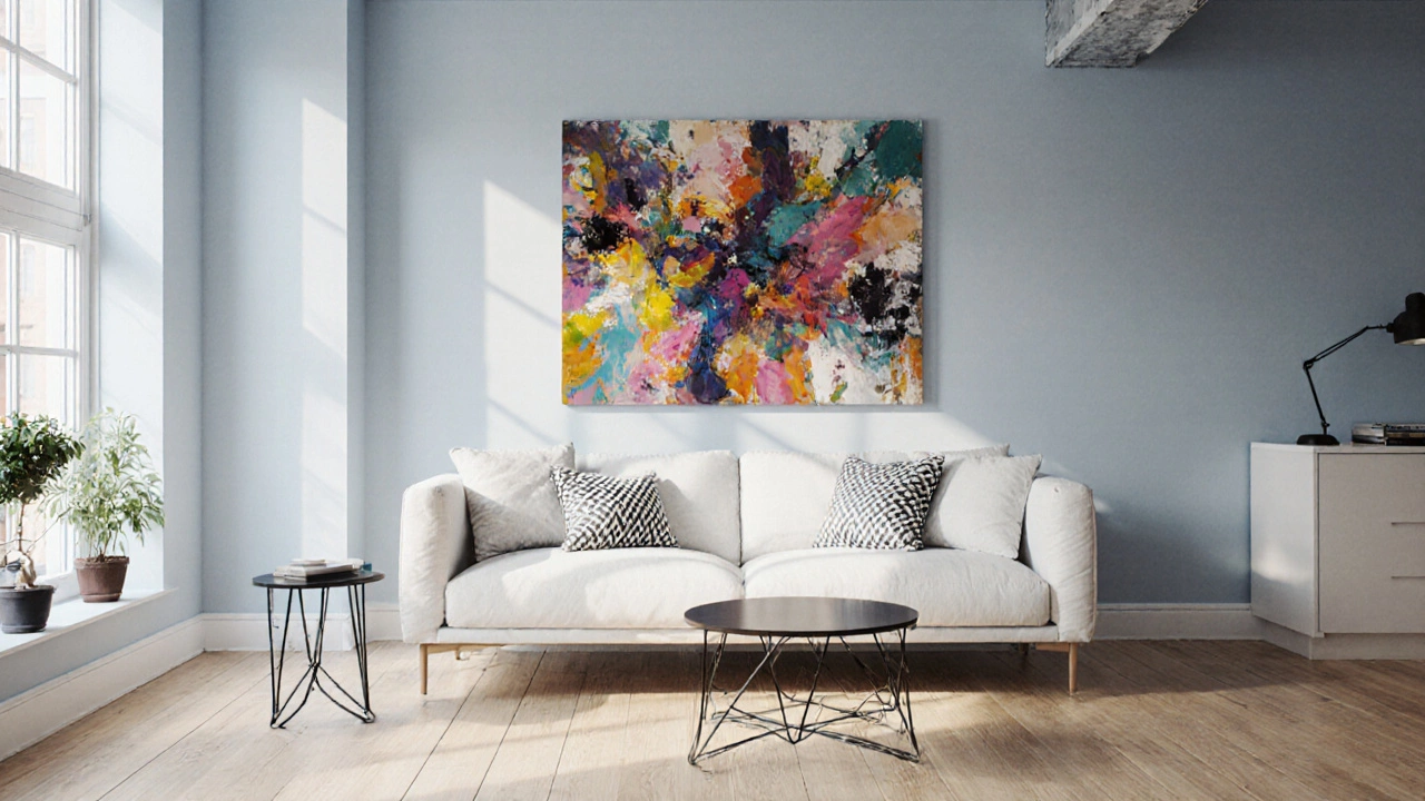
Before you pick a shade, consider the room lighting the mix of natural daylight, artificial fixtures, and the direction those lights hit surfaces. A white sofa in a sun‑filled loft feels airy; the same piece in a dim hallway can look stark. Gray adapts well to both cool daylight and warm LED bulbs, making it a safe middle ground. Black absorbs light, which can be cozy in a well‑lit living room but may make a small bedroom feel cramped. Natural wood reflects ambient warmth, often looking richer as light shifts through the day.
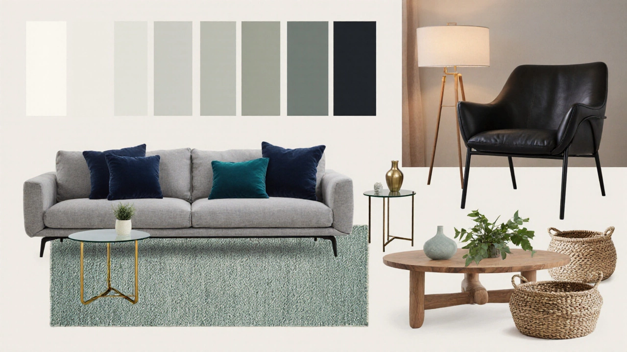
Pairing Strategies for Every Style
Below is a quick cheat sheet that shows which universal shade pairs naturally with popular décor themes.
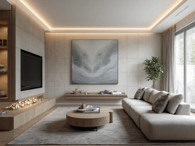
| Shade | Typical Mood | Ideal Wall Colors | Accent Recommendations | Maintenance Tips |
|---|---|---|---|---|
| White | Fresh, airy | Soft blues, pale greys, any pastel | Bold artwork, colored cushions, dark metal legs | Spot stains quickly; choose stain‑resistant fabric |
| Gray | Modern, calm | White, navy, earthy greens, rich jewel tones | Wooden side tables, brass hardware, textured throws | Dust regularly; fabrics hide fingerprints well |
| Black | Elegant, grounding | Light neutrals, crisp white, warm creams | Metallic accents, glass coffee tables, light‑colored rugs | Use protective pads on legs; choose leather for easy wiping |
| Natural wood | Warm, organic | Soft whites, muted greys, sage greens, or even deep teal | Woven baskets, plants, linen upholstery | Apply a finish sealant; avoid direct sunlight to prevent fading |
Fabric, Finish, and Texture Matter
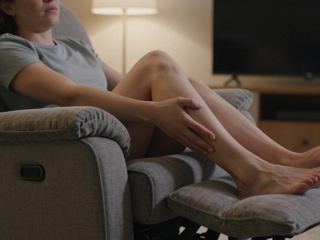
Even if the paint or veneer is neutral, the fabric the material covering upholstery, ranging from cotton blends to velvet or leather can shift perception. A matte finish on a gray sofa feels understated, while a glossy lacquer on a white piece gives a sleek, showroom vibe. Pairing a textured linen cushion with a smooth wooden frame adds visual interest without breaking the neutral rule.
Special Cases: Kids’ Rooms and High‑Traffic Areas
Parents often think neutral means “boring,” but these shades actually hide wear better than bright colors. Gray and natural wood are forgiving of scuffs. If you love white, opt for a high‑quality, stain‑resistant fabric and consider a darker base for the legs. Black furniture can hide dirt but may show dust more visibly-regular vacuuming and a protective seal help.
Common Mistakes and How to Dodge Them
- Choosing a shade that’s too close to the wall color, creating a “washed‑out” look. Add contrast with metal legs, patterned cushions, or a rug.
- Ignoring the room’s natural light. A dark wood coffee table can dominate a north‑facing room, whereas a lighter oak or white piece keeps the space balanced.
- Over‑accessorizing. The power of neutrals is in the flexibility they provide; let one or two statement pieces shine.
- Forgetting durability. In living rooms where pets roam, choose upholstery with a tight weave and a finish that can be wiped down.
Putting It All Together: A Quick Decision Flow
- Assess the room’s light exposure (bright, dim, mixed).
- Decide on the mood you want (airy, cozy, dramatic).
- Match the mood to a universal shade using the table above.
- Select a fabric/finish that supports the shade’s personality.
- Layer with two‑to‑three accent colors that pop against the neutral base.
Follow these steps and you’ll end up with furniture that feels intentional, not just “safe.”
Frequently Asked Questions
Can a white sofa look good in a dark‑painted room?
Yes. Pair it with warm lighting, a rug that adds color, and a few dark‑tone accessories to keep the space from feeling too stark. The contrast actually creates a focal point.
Is gray the most forgiving color for pets?
Gray hides fur and minor stains well, especially medium‑tone shades. Choose a performance fabric with a protective coating for extra peace of mind.
Should I avoid black furniture in small rooms?
Not necessarily. A black piece can add depth if balanced with light walls, mirrors, and reflective flooring. Keep the black furniture proportionate to the space.
How do natural wood tones stay neutral across trends?
Wood’s inherent variation-from light oak to dark walnut-provides a warm base that complements both bold and muted palettes. It ages gracefully, developing a patina that adds character.
What accent colors work best with gray furniture?
Blush pink, mustard yellow, teal, and rich navy create striking contrast. Choose one dominant accent and keep the rest subtle to maintain balance.