 24
Jun,2025
24
Jun,2025
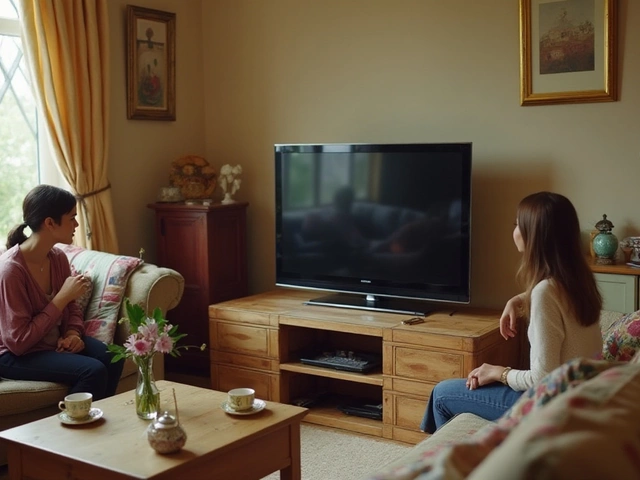
Ever stared at a magazine-perfect living room and wondered, “How do people actually manage that?” You’re not alone. I’ve lost track of how many times my cat, Tigger, has knocked a plant off the shelf, completely destroying my latest living room arrangement. Yet, somehow, some rooms just always look balanced, welcoming, even when real life—fur, clutter, and all—happens. That’s the magic of the golden rule in interior design. It’s not some snooty decorator secret. It’s a guiding principle that anyone can use, even if you don’t know your Eames from your IKEA.
What Exactly Is the Golden Rule in Interior Design?
Forget mysterious formulas or stuffy design jargon—the golden rule is simply about creating balance and harmony. Designers actually borrow the term from both math and art: the “golden ratio,” a number (about 1.618:1) that shows up in ancient Greek buildings, seashells, and classic paintings. In interiors, it transforms into something much more practical: the 60/30/10 rule. If you’ve never heard of it, here’s the gist—choose a dominant color (60% of the space), a secondary one (30%), and an accent (10%).
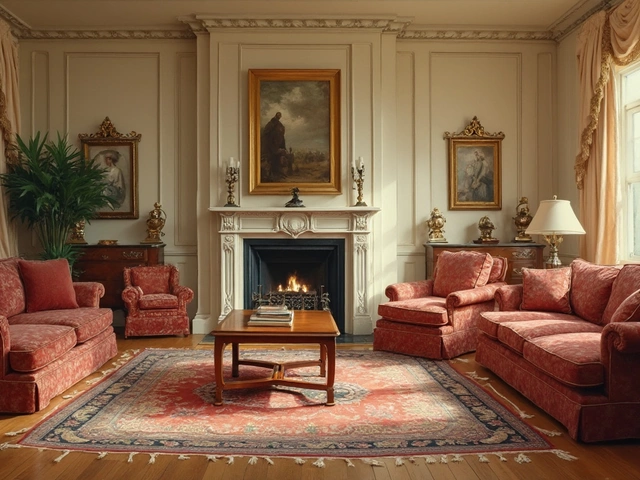
Picture a cozy living room—you might cover most of the space with soft greys, add deep blue for your sofas or drapes, and sprinkle mustard yellow in pillows or wall art. Humans are wired to like these proportions because they feel natural, not forced. In fact, a University of Vienna study found that people rated rooms following the golden rule as more relaxing and attractive (and, as a bonus, clutter was less noticeable). Designers live and breathe by these guidelines—not because they’re rules, but because they make life easier and spaces more inviting.
It’s not just about color, either. The golden rule touches layout, furniture scale, and how pieces interact in a room. Ever walk into a place and think, “Something feels off, but I can’t say what”? Chances are it’s because the elements aren’t working together—the visual weights are out of balance or something’s stealing the show when it shouldn’t. The golden rule is like using autopilot for good taste. Hit those 60, 30, and 10 percentages, and the room just…works.
How Designers Use the Golden Rule—and When They Break It
The best designers actually start every room with the golden rule, even if you never spot it in the finished space. They use it as a safety net. First, they pick one main influence: could be a color, a type of material, or even a vibe (“cozy retro,” “coastal morning,” etc.). They let that dominate sixty percent of the visual field—walls, big rugs, large furniture. Thirty percent could be in a slightly different tone or material, maybe chunky wood shelves or a statement armchair. Then, they pull in the final, smaller style punch—an accent color, a bold lamp, or artwork that makes you smile.
This trick doesn’t stop at color, either. The golden rule is a lifesaver when arranging furniture. Think of your main sofa or bed as sixty percent of the seating or sleep zone. Add supporting pieces—side chairs or dressers—to fill the 30%, and use things like throw pillows or an ottoman for that last 10% pop. Design pros almost always sketch out circles and rectangles, marking up floor plans to get this balance right before anyone moves a stick of furniture.
But do good designers always stick to the golden rule? Not really. Sometimes rules are made to be broken—especially if you know what you’re doing. If your vibe is “maximalist jungle” with a dozen plant babies (like my living room, pre-Tigger), you might pack more color and action into your space than 60/30/10. Or you might love symmetry so much that everything is split 50/50: fine, as long as you know you’re bending the classic balance for a reason. It’s all about knowing when to trust your gut and when to lean on the golden rule to save you hours of rearranging chaos.
Want proof that the golden rule actually makes a difference? Check out how the most beloved hotel lobbies or chic cafés arrange their spaces. Next time you’re in an Instagram-friendly spot, look for that big percentage of calm, neutral tones, a secondary thread running through the artwork or textiles, and one or two accents that pop in photos. That’s not luck—it’s the golden rule at work.
Smart Tips to Apply the Golden Rule Without Overthinking
Okay, maybe you don’t want to measure every piece of furniture to stick to textbook proportions. You really don’t have to. These clever hacks let you nail the golden rule and still have time for Netflix, or in my case, scooping Tigger’s litter box (the real interior challenge):
- Start with what you own. Find the dominant color or material you already have. Maybe it’s the wood floors, the beige sofa, or the deep blue rug. Let that set the 60% foundation.
- Swap out and rotate. If you keep rearranging the same art, vases, or throw pillows, try grouping them so one shade stands out, another complements, and just a couple “pop.” Take photos to check if it feels right.
- Buy in threes. Designers love odd numbers because they’re less stiff. Get three accent items—say, vases in different heights or pieces of art in related frames—for your 10% accent zone and arrange them in a spot that people notice most: the coffee table, a console, or entryway shelf.
- Remember: less is more. Each room should have breathing space. Tigger would probably use that extra floor space for zoomies, but for humans, empty spots make everything else look better. If a room feels crowded, remove something from the 30% or 10% group first.
- Don’t obsess over exact numbers. If you’re close, you’re winning. Use the golden rule to avoid common mistakes (like two “accent” walls fighting for attention), not to freak out over whether you’re at exactly 30% navy blue.
The golden rule is not just for people with designer budgets, either. Some of the best small apartments or family homes follow this method, just with clever storage, multipurpose pieces, and a couple of killer accent lamps from the thrift store. Check social media for before-and-after shots of spaces reorganized by the golden ratio, and you’ll spot the improvements even if you can’t describe them. (Bonus: people are more likely to compliment your place, even with evidence of cats or kids on the furniture.)
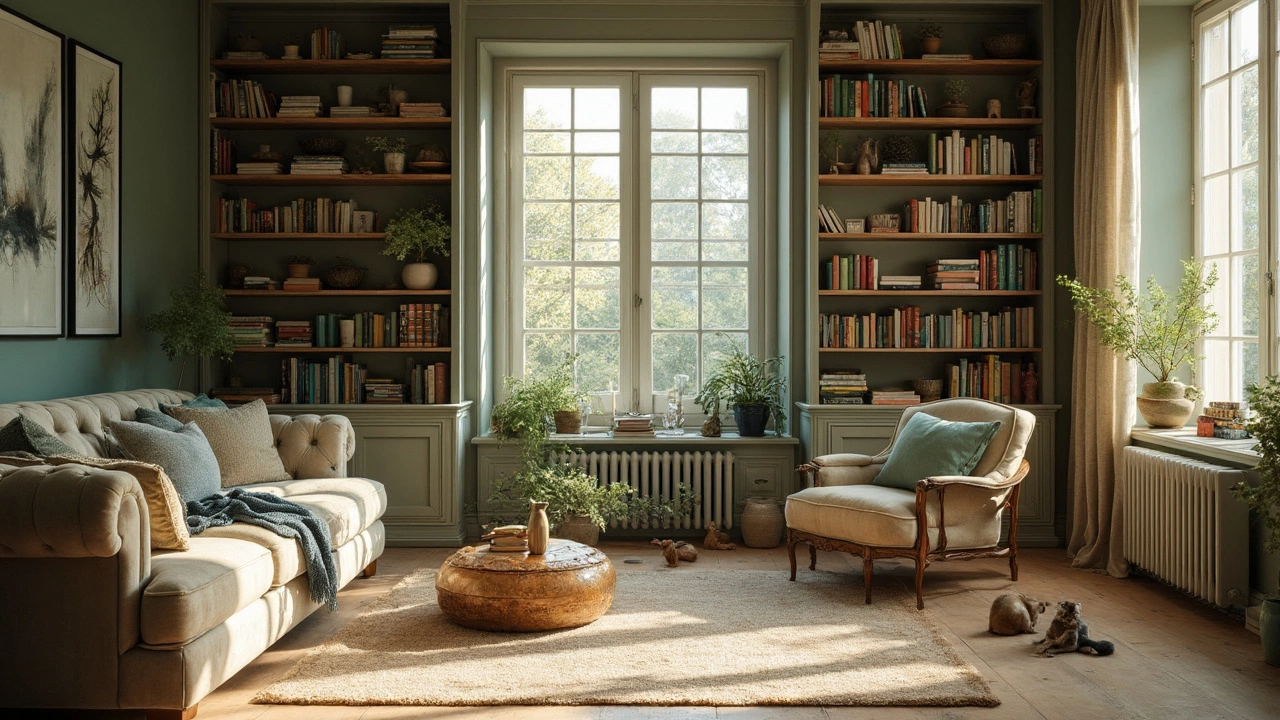
Room-by-Room Cheatsheet: Using the Golden Rule for Every Space
You might think the golden rule is just for stylish living rooms, but it actually rocks in every corner—from chaotic kid’s rooms to that awkward hallway you’re not sure what to do with. Here’s how to use it for different spaces in totally real-life ways:
- Living room: Let the rug, walls, or biggest furniture set the tone (the “60”), layer in a secondary color or texture in chairs, media units, or curtains (the “30”), and rely on a single accent like a wild piece of art or a bold lamp (“10”).
- Bedroom: The bedspread and headboard define your main look. Add secondary colors with side tables or throw blankets, and bring in an accent color with a pillow, signature photo, or even a reading lamp.
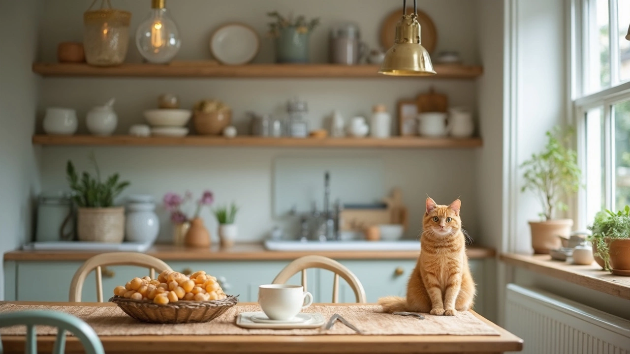
- Kitchen: Most kitchens have strong bones—cabinets and counters. Work with what you’ve got: let those be 60%, use appliances or a backsplash for 30%, and add wild color in utensils, a fruit bowl, or a potted fresh herb.
- Home office: Bookcases or the desk fill the main visual band. Get that 30% from organizers, file holders, or even a favorite chair, then go bold with a tiny plant, framed print, or quirky mug in your 10% zone.
- Entryway: Keep it calm (walls and floors), reinforce with a runner or mirror, and go eye-catching with hooks, baskets, or a funky umbrella stand.
Here’s a quick visual cheat for what proportions might look like when applied:
| Room Element | Percent % | Example |
|---|---|---|
| Main Color/Material | 60 | Walls, floors, largest furniture |
| Secondary Color/Style | 30 | Medium furniture, curtains, rugs, artwork |
| Accent Color/Detail | 10 | Pillows, decor, art, small accessories |
Notice the numbers don’t have to match exactly, but when you keep them in mind, everything starts to gel. Lighting, one of the most overlooked design tools, can help reinforce these bands: think warm light for neutrals, brighter spots for highlights, and dimmable or playful fixtures for the 10% “wow” factor.
When the Golden Rule Just Doesn’t Seem to Work
Let’s be real—sometimes you follow the golden rule and your room still looks…bleh. No shame, it happens. There may be furniture you can’t move, landlord paint rules, or, like at my place, little fur tornadoes ruining your order every day. Don’t ditch the golden rule—just make a few adjustments to adapt.
Start by looking at the basics: is scale off? A room will always feel weird if the furniture is way too big or tiny for the space, no matter the colors. Correction: put the bulkiest pieces along the longest walls, and keep walkways open. Second, assess lighting—are there weird shadows or super-bright bulbs making your accent pieces look strange? Switch to softer bulbs and look for ways to bounce light off walls and ceiling.
If your color split seems right but harmony is missing, check patterns and textures. Maybe your sofa is competing with a patterned rug, or your accent color is too strong. Dial one down—it’s not about quantity alone, but balance. And don’t forget, the room should feel comfortable for you—it doesn’t matter if it matches a catalog if you don’t want to hang out there. Try your living space out for a week, jot notes on what bugs you, and adjust from there.
Sometimes, the problem is just too much stuff. Remove just 10% of visible objects and watch the space breathe. This isn’t minimalism, it’s creating focus. If you love displaying treasures, rotate them every few months. That makes the room feel fresh—plus, it limits the number of things that can be knocked off by nosy cats or kids.
Last tip: if you’re really stuck, invite a friend over. Someone with fresh eyes can spot where the balance is off and give you honest feedback. Bonus points if you bribe them with pizza or let them pick the playlist while you move things around together.
So, if you want a space that feels as good as it looks—comfortable, visually appealing, and guest-ready, even with cats or kids in tow—start with the golden rule. Use it as a jumping-off point, then break it when you find your own groove. And remember: every great room is a little bit messy, a little bit personal, and a lot based on smart, balanced choices.