 6
Apr,2026
6
Apr,2026
The Core Timeless Palette
If you want a room that stays relevant, you have to start with neutrals. But not all neutrals are created equal. Some lean too 'cool' or too 'warm,' which can make them feel tied to a specific era (remember the gray-everything phase of the 2010s?). The goal is to find balanced tones that harmonize with various wall colors.
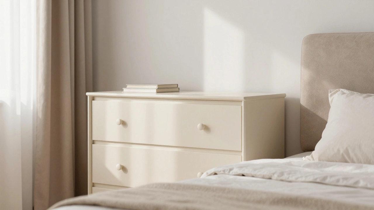
White is a versatile, bright neutral that maximizes light and creates a sense of cleanliness and space. In a bedroom, a crisp white or a soft cream dresser makes the room feel airy. However, avoid a 'stark' hospital white. Instead, look for warm whites or 'off-whites' that don't feel sterile. White furniture is a blank canvas; it allows you to swap out a navy blue duvet for a sage green one without any visual clashing.
Beige and Taupe are earthy, warm neutrals that bridge the gap between white and brown. These colors are incredibly forgiving. They hide dust better than black furniture and don't feel as rigid as pure white. A taupe upholstered headboard is a classic choice because it feels sophisticated and organic, blending seamlessly with almost any skin tone or lighting condition.
Black is a bold, high-contrast neutral that provides a grounding effect in a room. While some fear it's too heavy, black furniture is actually a staple of modern and traditional design. A black metal bed frame or a sleek black nightstand acts like a piece of jewelry for the room. It creates a sharp silhouette that anchors the space, especially when paired with lighter walls.
The Role of Natural Wood Tones
Wood isn't just a material; in the design world, it's a color. The most timeless wood finishes are those that look like they came straight from nature, rather than those that have been heavily stained with artificial pigments.
Oak, especially in a light to medium tone, is the gold standard for longevity. It has a balanced grain and a neutral warmth that doesn't lean too orange or too red. Whether it's a white oak or a red oak, these tones provide a sense of stability and warmth. Think of a solid oak dresser; it's a piece that could have worked in 1950 and will still work in 2080.
Walnut is a rich, dark brown wood known for its deep chocolate hues and elegant grain patterns. If you want a room that feels moody, expensive, and masculine, walnut is your best bet. Unlike the very dark espresso stains that were popular a decade ago, natural walnut has a depth and variety of color that keeps it from looking like a flat, painted surface.
A great rule of thumb: if the wood looks like it would be at home in a forest, it's likely timeless. If it looks like it was dyed in a lab to be a specific 'trendy' shade of gray-brown, be careful.
| Color/Finish | Vibe | Maintenance | Versatility |
|---|---|---|---|
| Warm White | Airy & Clean | High (Shows stains) | Maximum |
| Light Oak | Organic & Cozy | Low (Hides dust) | High |
| Walnut | Sophisticated | Medium | Medium-High |
| Matte Black | Modern & Bold | Medium (Shows dust) | High |
| Taupe/Beige | Soft & Calm | Low | High |
Avoiding the 'Trend Trap'
How do you know if a color is timeless or just a fad? Look at the history of Interior Design, which is the art and science of enhancing the interior of a building to achieve a healthier and more aesthetically pleasing environment. Trends usually happen in cycles. For example, the "all-gray" trend of the last few years was a reaction to the "beige" trend of the early 2000s. If you buy furniture in a color that is currently everywhere on social media, you're essentially buying a timestamp.
Avoid high-saturation colors for your big-ticket items. Who not to buy a bright teal wardrobe or a neon yellow dresser. Why? Because these colors trigger a strong emotional response that eventually fades into boredom. Instead, keep the high-saturation colors for things that are easy to replace, like throw pillows, a small side table, or a piece of art.
Another pitfall is the "too-matched" set. Buying a bedroom suite where the bed, nightstands, and dresser are all the exact same shade of white can actually make a room feel dated. It looks like a showroom rather than a home. A more timeless approach is to mix neutrals. Try a walnut bed frame with creamy white nightstands. This layering of timeless colors creates a curated, collected look that feels intentional and high-end.
Matching Furniture to Your Wall Color
Your furniture doesn't exist in a vacuum; it interacts with your walls. To keep things timeless, use the concept of contrast. If you have dark walnut furniture, light-colored walls (like a soft eggshell or pale gray) prevent the room from feeling like a cave. If you have white furniture, a slightly deeper wall color-like a dusty blue or a muted terracotta-stops the room from looking washed out.
When choosing between a warm or cool tone, look at the light in your room. North-facing rooms get cool, bluish light, so they benefit from warm furniture tones (like oak or beige) to keep the space from feeling chilly. South-facing rooms get warm, golden light, meaning they can handle cooler tones (like black or crisp white) without feeling stark.
Material Matters: Texture as Color
Sometimes the most timeless "color" is actually a texture. Consider Upholstery, which refers to the padded fabric covering on furniture, often used for headboards and benches. A linen-textured fabric in a light oatmeal color is infinitely more timeless than a smooth, shiny polyester fabric in the same shade. The texture adds a layer of visual interest that keeps the neutral color from looking boring.
Similarly, a matte finish on wood or metal is generally more timeless than a high-gloss finish. High-gloss finishes tend to be tied to specific eras (think 1970s lacquer or 2000s high-glam). A matte or satin finish absorbs light more naturally and blends into the environment, which is the hallmark of a timeless piece.
Is gray still a timeless color for bedroom furniture?
While gray was incredibly popular for years, it's moving from "timeless" to "trendy." Specifically, cool-toned, blue-grays can make a room feel cold. If you love gray, opt for "greige" (a mix of gray and beige). Greige is more timeless because it contains warm undertones that make it more adaptable to different lighting and decor styles.
What is the safest wood color to buy?
Natural Oak is widely considered the safest bet. Its medium-light tone and neutral grain work with almost any color scheme, from modern minimalism to rustic farmhouse. It's a staple in high-quality furniture and maintains its value and style over decades.
Can I mix different wood tones in one bedroom?
Yes, and you actually should. Mixing a dark wood (like walnut) with a lighter wood (like oak) makes the room look more organic and less like a matched set from a store. The key is to keep the undertones similar-don't mix a very red-toned cherry wood with a very yellow-toned pine, as they will clash.
Does white furniture show too much wear and tear?
White furniture can show scuffs and stains more easily than darker options. However, a high-quality semi-gloss or satin finish is easier to wipe clean than a flat matte finish. If you're worried about wear, choose white for pieces that don't handle heavy daily friction, like a headboard, and go for a wood tone for a dresser.
Are bold colors ever timeless?
Rarely for large furniture pieces. Bold colors evoke a specific mood and time period. If you want a pop of color, use it in your accessories-pillows, blankets, or a single accent chair. This allows you to update the "vibe" of your room for a fraction of the cost of replacing a wardrobe or bed frame.
Next Steps for Your Bedroom Makeover
If you're starting from scratch, focus on the largest piece first-usually the bed. Choose a timeless neutral or natural wood for the frame. Once that anchor is in place, you can layer in secondary pieces like nightstands and dressers. If you're updating an existing room, try adding a few neutral-colored accents to see how they interact with your current furniture before committing to a full replacement.
For those who struggle to visualize, try the "Three-Color Rule": choose one primary neutral (like white), one secondary neutral (like oak), and one accent color (like sage green). As long as your furniture sticks to the first two, your room will always feel balanced and timeless.