 21
May,2026
21
May,2026
Built-In Bookcase Design Advisor
Tell us about your project:
Result Title
RECOMMENDED STRATEGY
Strategy goes here...
PAINT FINISH & TECHNIQUE
- ★ Finish: Satin or Semi-Gloss
- ★ Color Match: Exact Wall Match
- ★ Pro Tip: Tip text here.
Select your options and click "Get Design Recommendation" to see if you should blend in or stand out.
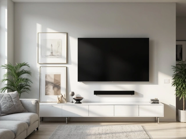
Picture this: you walk into a living room that feels twice as big as it actually is. The lines are clean, the space breathes, and your eyes glide effortlessly across the room without hitting any visual roadblocks. Chances are, the built-in bookcases custom storage units integrated into the architecture of a room blend perfectly with the walls. It’s not magic; it’s design strategy. When deciding whether to paint your custom shelving the same color as your walls, you aren’t just picking a shade-you’re choosing how your home feels.
The short answer? Yes, usually. Painting built-ins the same color as the surrounding walls creates a sense of continuity that makes small rooms feel expansive and large rooms feel cohesive. But like most things in interior design, there are exceptions. Sometimes, contrast is exactly what you need to anchor a space or highlight a collection. Let’s break down when to blend in and when to stand out, so you can make a choice that works for your specific layout and style.
The Power of the "Invisible" Shelf
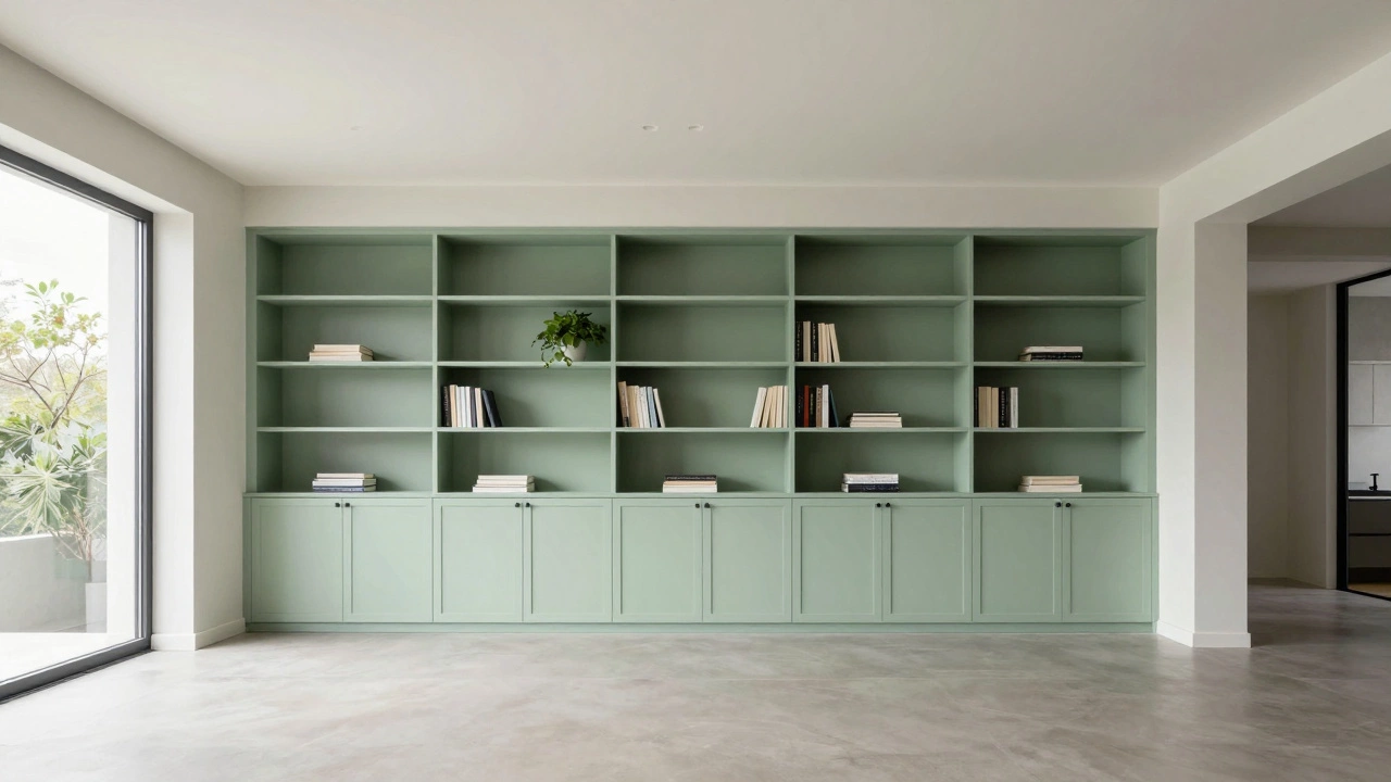
Why do designers obsess over painting built-ins the same color as the walls? It comes down to perception. When a bookcase disappears into the background, your brain stops registering it as furniture and starts seeing it as part of the architecture. This technique, often called "monochromatic blending," tricks the eye into ignoring the bulk of the unit.
In smaller spaces, this is crucial. If you have a cozy Melbourne apartment or a narrow hallway, a dark wood bookcase against a light wall will visually cut the room in half. It creates a heavy block that shrinks the perceived square footage. By painting the shelves, the frame, and even the trim in the exact same hue as the walls, you remove those visual barriers. The result? A room that feels airy, open, and significantly larger than its actual dimensions.
This approach also simplifies your decision-making process. You don’t have to worry about coordinating wood tones with sofa fabrics or rug patterns. The storage becomes neutral canvas, allowing your decor-artwork, plants, books-to take center stage without competing with the furniture itself.
When Contrast Works Better
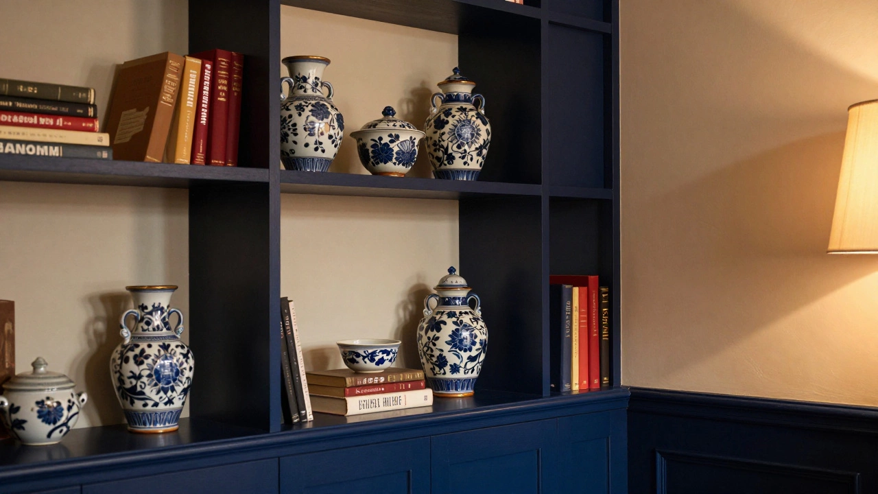
Blending isn’t always the right move. There are specific scenarios where making your built-in bookcases pop adds character and depth to a room. Think about the purpose of the space. Is it a library where the books are the stars? Or a formal dining room where the cabinetry serves as a backdrop?
If you want to showcase a curated collection of colorful ceramics, rare first editions, or vibrant art objects, a contrasting bookcase acts as a frame. A deep navy blue or charcoal gray shelf against a soft cream wall draws attention directly to the items on display. It creates a focal point rather than hiding away. In larger rooms with high ceilings, a monochromatic look might feel flat or unfinished. Adding a darker tone to the built-ins grounds the space, preventing it from feeling too ethereal or hotel-like.
Consider the architectural style of your home too. In heritage homes with original features like cornices and fireplaces, a painted white or off-white bookcase can clash if the rest of the room leans toward warmer, traditional tones. Here, a natural wood finish or a rich stain might complement the existing timber floors and moldings better than a seamless wall match.
Material Matters: Wood vs. Paint
The material of your built-in bookcases plays a huge role in how they interact with wall color. Solid wood, MDF (medium-density fiberboard), and plywood all react differently to paint and stains. Understanding these differences helps you decide whether to go for a seamless look or embrace the texture.
MDF engineered wood product made by breaking down hardwood or softwood residuals into fibers is the most common material for custom built-ins because it’s smooth, affordable, and takes paint beautifully. Since MDF has no grain, painting it the same color as the walls creates a truly seamless effect. There’s no underlying texture to disrupt the visual flow. However, if you try to stain MDF to look like wood, it often looks fake because there’s no real grain to enhance. So, if you choose MDF, painting it to match the walls is usually your best bet.
Plywood, on the other hand, has a visible layered edge and sometimes a subtle grain depending on the veneer. If you love the warmth of natural wood, you might opt for a clear sealant instead of paint. In this case, matching the wall color becomes less relevant. Instead, you’d coordinate the wood tone with your flooring or other wooden elements in the room. A honey-oak plywood bookcase pairs well with warm beige walls, creating a harmonious but distinct look.
Solid timber offers the highest durability and beauty but comes at a premium price. With solid wood, you have the option to refinish it later if trends change. If you paint solid wood the same color as the walls, be aware that wood expands and contracts with humidity changes. Over time, this movement can cause hairline cracks in the paint, especially in older homes. If you’re going for a perfect seamless look, consider using flexible paints designed for wood surfaces.
| Material | Best Finish | Seamless Potential | Durability |
|---|---|---|---|
| MDF | Paint | High (no grain) | Moderate (can swell if wet) |
| Plywood | Stain or Paint | Medium (layered edges visible) | High |
| Solid Timber | Oil, Stain, or Paint | Low (grain shows through) | Very High |
Lighting and Color Perception
Here’s a trick that catches many homeowners off guard: the same paint color looks different on a wall versus on a bookcase. Why? Because of lighting and shadow. Walls are flat planes that reflect light evenly. Bookcases have depth-they have shelves, sides, and recessed areas that cast shadows.
If you paint your built-ins the exact same color as your walls, the recessed parts might appear slightly darker due to lack of direct light. To counteract this, some designers recommend choosing a shade one or two tones lighter for the interior of the shelves. This keeps the space feeling bright and prevents the back corners from looking muddy or dirty. Alternatively, install LED strip lighting inside the shelves. Not only does this improve visibility, but it also washes out the shadows, ensuring the color remains consistent with the walls.
Natural light direction matters too. In Melbourne, where we get plenty of northern sunlight, colors can fade faster if exposed to direct sun. If your bookcase is near a window, use UV-resistant paint to prevent yellowing or fading over time. South-facing rooms, which receive cooler, indirect light, tend to keep colors true longer but may make whites look grayish. Always test your paint sample on both the wall and a piece of scrap wood from your bookcase before committing.
Trim and Detailing: The Devil in the Details
Achieving a truly seamless look requires more than just matching the main panels. You need to think about trim, molding, and hardware. If your walls have skirting boards, crown molding, or architraves, should they match the walls or the bookcase?
For the ultimate invisible effect, paint everything-the walls, the bookcase, and all the trim-in the same color. This unifies the entire vertical plane. However, if you want a bit more definition, consider painting the trim a slightly lighter or darker shade. This subtle contrast highlights the craftsmanship of the built-in without breaking the flow. For example, a soft sage green wall with a sage green bookcase and crisp white trim creates a fresh, modern look that still feels cohesive.
Hardware is another detail that can make or break the design. If you’re adding doors to your bookcase, handle-less push-to-open mechanisms maintain the clean lines. If you prefer knobs or pulls, choose finishes that complement your other metal fixtures in the room-brass, black matte, or brushed nickel. Avoid mixing metals unless you’re intentionally going for an eclectic vibe. Consistent hardware ties the built-in into the broader design narrative of the home.
Practical Tips for Execution
Deciding on the color is only half the battle. Getting the execution right ensures your investment lasts. Here are some practical steps to follow:
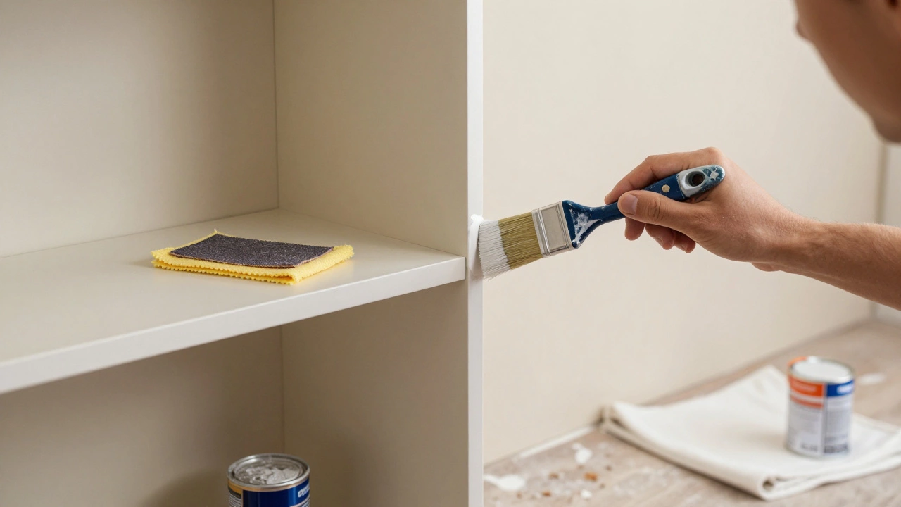
- Prep is key: Sand the surface of your bookcase thoroughly before painting. Even MDF needs a light sanding to help the primer adhere. Wipe away all dust with a tack cloth.
- Use quality primer: Don’t skip the primer. It seals the surface and provides a uniform base for your topcoat. For MDF, use a shellac-based primer to prevent tannin bleed-through.
- Choose durable paint: Opt for satin or semi-gloss finishes. These are easier to clean and more resistant to scuffs than flat matte paints. Bookcases get handled daily, so durability matters.
- Paint in thin coats: Apply two to three thin coats rather than one thick one. This prevents drips and ensures an even finish. Allow each coat to dry completely before applying the next.
- Protect during installation: If you’re having the bookcases installed after painting the walls, cover the shelves with drop cloths to avoid splashes. Conversely, if installing first, mask off the edges carefully to protect the walls.
Remember, perfection isn’t necessary. Small imperfections add character, especially in lived-in spaces. The goal is a cohesive look that enhances your daily life, not a museum exhibit.
Troubleshooting Common Issues
Even with careful planning, things can go sideways. What if you’ve already painted the walls and now realize the bookcase doesn’t match? Or what if the seamless look feels too boring?
If the colors clash, you have a few options. First, check the undertones. A pinkish-beige wall might clash with a yellowish-cream bookcase. Try repainting the bookcase with a swatch of the wall color to see if it blends better under artificial light. If not, consider adding a bold accent color to the interior of the shelves. A deep teal or mustard yellow inside can create a surprising pop that distracts from any slight mismatch on the exterior.
If the seamless look feels too plain, introduce texture. Use woven baskets, textured rugs, or varied book spines to add visual interest. Plants are also excellent for breaking up monotony. A trailing pothos or a tall snake plant placed on top of the bookcase brings life and dimension to the space without altering the paint job.
Finally, don’t be afraid to evolve. Interior design is not set in stone. If you start with a matching scheme and later crave contrast, you can always repaint the bookcase. Just ensure you use a good primer to cover the old color effectively.
Should I paint my built-in bookcases the same color as my walls?
Generally, yes. Painting built-in bookcases the same color as your walls creates a seamless, expansive look that makes rooms feel larger and more cohesive. This is especially beneficial in small spaces or open-plan layouts. However, if you want to highlight a collection or add architectural interest, a contrasting color can work well.
What is the best type of paint for built-in bookcases?
Satin or semi-gloss enamel paints are ideal for built-in bookcases. They offer durability, resistance to scuffs, and easy cleaning compared to flat matte finishes. Ensure you use a high-quality primer underneath to seal the surface, especially if using MDF or plywood.
How do I make my bookcase disappear into the wall?
To make a bookcase disappear, paint it the exact same color as the walls, including all trim, molding, and skirting boards. Use handle-less doors if applicable, and minimize hardware visibility. Good lighting inside the shelves also helps reduce shadows that reveal depth.
Can I stain my built-in bookcases instead of painting them?
Yes, staining is a great option if you want to highlight the natural beauty of wood. However, staining works best with solid timber or high-quality plywood veneers. MDF cannot be stained effectively as it lacks grain. Stained bookcases will stand out against painted walls, creating a warm, traditional aesthetic.
Does lighting affect how bookcase colors look?
Absolutely. Recessed shelves cast shadows, making them appear darker than flat walls. Natural light direction and intensity also change color perception. Always test paint samples in the actual room under both natural and artificial light before committing to a full paint job.