 12
Oct,2026
12
Oct,2026
Interactive Shelf Styler
Use this tool to understand how breaking up long lines of books with gaps and decorative objects creates a balanced, professional look. Adjust the sliders to see when you break the "5-Finger Rule".
Styling Controls
The 5-Finger Rule:
No block of books should exceed ~4-5 fingers wide (~3-4 inches) without an interruption.
You’ve bought the books. You’ve assembled the bookcase. But now you’re staring at empty shelves, wondering why your collection looks like a chaotic pile of paperbacks rather than a curated display. It’s a common frustration. Most people just line books up vertically until they hit the end of the shelf, creating that dreaded "bowing" effect where spines lean and gaps look accidental. The fix isn’t buying more furniture; it’s applying a simple spatial heuristic known as the 5-finger rule.
This isn’t about measuring with your actual hand (though that’s a handy trick if you don’t have a tape measure). The 5-finger rule is a visual balance technique used by professional stylists to break up monotony and create breathing room. If you apply this correctly, your shelves will instantly look intentional, expensive, and inviting. Here is how to master the spacing, grouping, and layering that separates a cluttered mess from a designed space.
What Exactly Is the 5-Finger Rule?
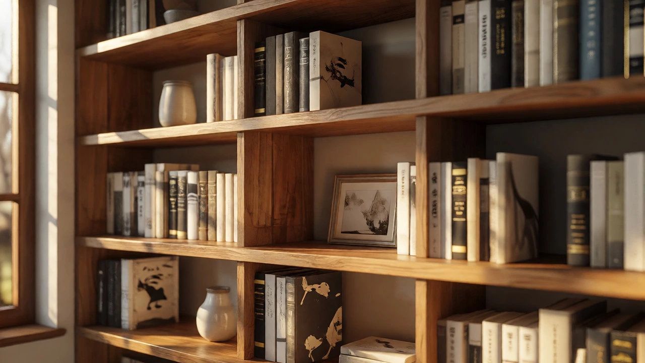
At its core, the 5-finger rule dictates that no section of books on a shelf should span more than five fingers wide (approximately 3 to 4 inches or 7 to 10 centimeters) without an interruption. These interruptions are typically decorative objects, angled books, or deliberate negative space.
Why five? Because human eyes struggle to track long, uniform lines. A solid block of 20 identical hardcovers creates a visual wall that feels heavy and static. By breaking these blocks into smaller clusters, you introduce rhythm. Think of it like punctuation in a sentence. Without commas or periods, a paragraph is exhausting to read. Similarly, without breaks in your book arrangement, your eye slides right off the shelf. The goal is to create micro-vignettes within each shelf section.
It’s important to note that this isn’t a rigid law. It’s a guideline to prevent the "library dump" look. If you have a massive encyclopedia set, you might keep them together, but you’ll want to flank them with something contrasting. The rule applies primarily to mixed collections where spine colors and sizes vary wildly.
Step-by-Step Implementation Guide
Ready to restyle? Don’t pull everything out at once unless you enjoy chaos. Start with one shelf. Follow this workflow to ensure balanced results every time.
- Clear and Categorize: Remove all items from the shelf. Group your books by color, size, or genre. Color blocking is visually striking but can feel sterile if overdone. Mixing genres with similar spine heights often looks more organic.
- Create Anchor Points: Place your largest or most interesting decorative object first. This could be a vase, a sculpture, or a framed photo. This object becomes the focal point around which the books will orbit.
- Apply the 5-Finger Limit: Begin placing books next to the anchor. Stop when the group reaches roughly four to five fingers wide. Leave a small gap (about half an inch).
- Introduce Variation: In the gap, place a smaller decorative item, a stack of magazines laid horizontally, or a single book propped open. This breaks the vertical line.
- Repeat and Balance: Continue across the shelf. Ensure the weight is distributed evenly. If you have a heavy dark book cluster on the left, balance it with a lighter, airy arrangement on the right.
The key here is asymmetry. Perfect symmetry can look like a museum exhibit-cold and distant. Asymmetry feels lived-in and cozy. Use odd numbers for groups of three or five decorative items alongside your book clusters.
Common Mistakes That Break the Flow
Even with good intentions, it’s easy to fall back into bad habits. The biggest offender is the "full shelf syndrome." People feel guilty leaving empty space, so they cram books in until there’s no room to breathe. Remember, negative space is a design element, not wasted real estate. It allows the eye to rest.
Another mistake is ignoring depth. If your bookcase is deep (over 12 inches), pushing all books to the front edge leaves a shadowy void behind them. Instead, layer your items. Place taller books at the back and shorter stacks or decorative boxes in the front. This creates dimensionality. From a distance, the shelf looks full and rich; up close, you discover hidden layers.
Also, beware of the "rainbow trap." While color-coding is popular, arranging books strictly by rainbow order can make a room feel like a child’s bedroom, regardless of age. Unless you’re aiming for a very specific pop-art vibe, mix neutral tones with colorful spines. Let the decorative objects carry the bold colors, letting the books provide texture and muted background noise.
Advanced Styling Techniques for Deep Shelves
Once you’ve mastered the basic spacing, you can elevate your game with advanced layering. This is particularly useful for modern floating shelves or built-ins with significant depth.
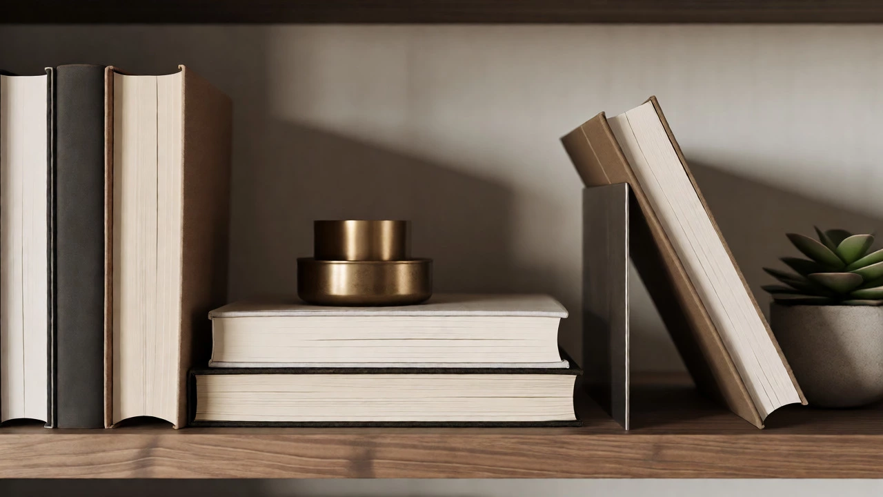
- The Horizontal Stack: Take a group of three to five books and lay them flat. Place a decorative bowl or candle on top. This lowers the visual center of gravity and prevents the shelf from feeling too tall and narrow.
- Angled Displays: Prop a single beautiful hardcover against a bookend or a small easel. Angling a book changes its silhouette, turning it into a piece of art rather than just storage.
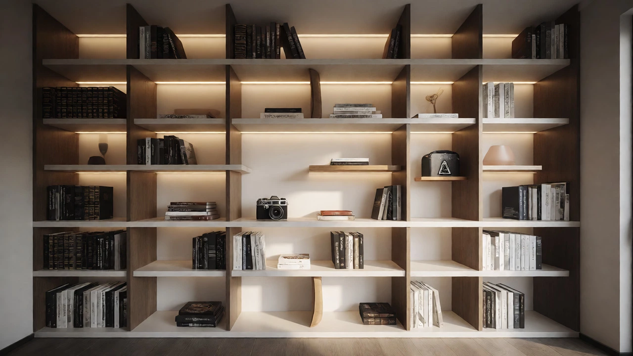
- Mixed Media Integration: Intersperse non-book items frequently. A small potted succulent, a vintage camera, or a travel souvenir adds personality. These items serve as the "periods" in your visual sentence.
Lighting plays a crucial role here. If your bookcase has integrated LEDs, position them to highlight the gaps between book clusters. Light bouncing off the side of a decorative object draws attention to the spacing, reinforcing the rhythm you’ve created.
When to Break the Rules
Design rules are meant to be broken, but only when you know why you’re breaking them. There are scenarios where the 5-finger rule doesn’t apply. For instance, if you are storing a complete set of leather-bound classics, keeping them in one continuous block emphasizes their collective value and uniformity. In this case, the sheer volume becomes the aesthetic feature.
Similarly, in minimalist interiors, you might opt for large sections of empty space punctuated by a single book and a single object. This is less about the 5-finger limit and more about extreme minimalism. However, even then, the principle of "intentional grouping" remains. Every item must earn its place.
| Approach | Visual Effect | Best For | Ease of Maintenance |
|---|---|---|---|
| Traditional Vertical | Dense, uniform, library-like | Small spaces, maximum storage | High (easy to add/remove) |
| Color Blocked | Bold, graphic, modern | Contemporary homes, kids' rooms | Medium (hard to find titles) |
| 5-Finger Rule (Stylized) | Airy, curated, dynamic | Living rooms, offices, display areas | Low (requires careful arrangement) |
| Minimalist | Calm, spacious, high-end | Scandinavian, Zen aesthetics | Medium (dust shows easily) |
Troubleshooting Your Arrangement
If your shelves still feel "off," check these three things. First, look for bowing. Are your books leaning? This means you’ve packed them too tightly without enough support. Add sturdy bookends at the end of each cluster to keep them upright. Second, check for visual noise. Do you have too many small, busy patterns competing for attention? Consolidate small items into trays or baskets to unify them. Third, assess the height variance. If everything is exactly the same height, it looks flat. Vary the heights by stacking books horizontally or using taller vases.
Finally, step back. View your bookcase from across the room. Does your eye land on a focal point, or does it slide off? If it slides off, increase the contrast between your book spines and your decorative objects. High contrast stops the gaze; low contrast lets it wander.
Does the 5-finger rule apply to e-readers or digital displays?
Not directly, since digital displays don't have physical spines. However, the principle of visual chunking applies. On a tablet interface, grouping apps or books into folders or distinct pages mimics the cognitive ease provided by the 5-finger rule in physical space.
Can I use the 5-finger rule for other furniture besides bookcases?
Absolutely. This heuristic works for kitchen counters, bathroom vanities, and coffee tables. Any surface prone to clutter benefits from breaking items into small, spaced-out clusters rather than lining them up edge-to-edge.
What if my books are all different sizes?
Mixing sizes is actually easier to style. Use the larger books as anchors and fill gaps with smaller paperbacks or decorative objects. The variation in height naturally creates the rhythm the 5-finger rule aims to achieve artificially.
How do I keep dust off my styled shelves?
Dusting is harder with complex arrangements. Use a feather duster or a microfiber cloth wrapped around a ruler to reach between tight book clusters. Vacuuming with a brush attachment is also effective for deeper cleaning.
Is there a minimum number of books required for this rule?
No. Even with just two or three books, you can apply the concept by ensuring they aren't isolated in a vast empty space. Pair them with a complementary object to create a cohesive vignette.