 16
Mar,2026
16
Mar,2026
When you buy furniture, you're not just buying a piece for now-you're investing in something that will live in your home for years. That’s why so many people ask: what color furniture is timeless? The answer isn’t about following trends. It’s about choosing shades that work with light, space, and life-no matter how your style evolves.
Neutral Isn’t Boring-It’s Smart
Think timeless furniture, and you probably picture beige, gray, or taupe. But neutrality isn’t about being dull. It’s about flexibility. A deep charcoal sofa, for example, hides wear and tear better than white. It pairs with bold rugs, bright pillows, or even metallic accents without clashing. In Melbourne homes, where natural light shifts dramatically from season to season, neutral tones adapt. They don’t fight the light-they enhance it.
One of the most reliable neutrals is greige-a mix of gray and beige. It’s warmer than pure gray, cooler than cream, and works in both modern and traditional spaces. Brands like IKEA, Freedom, and local Australian makers have been using greige in their best-selling pieces for over a decade. Why? Because it doesn’t date. A greige armchair from 2018 still looks current today.
Black: The Quiet Powerhouse
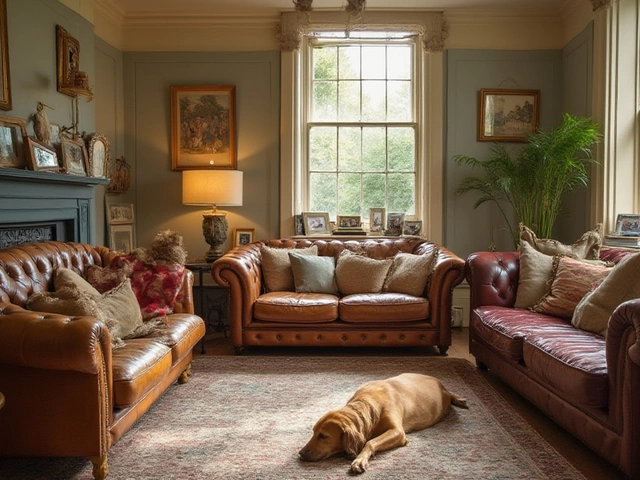
Black furniture has a reputation for being dramatic. But in reality, it’s one of the most practical choices. A black wooden dining table, for instance, doesn’t show scratches like lighter woods. A black metal frame on a side table adds structure without overwhelming the room. In homes with dark floors or moody walls, black furniture doesn’t disappear-it anchors the space.
Here’s the secret: black furniture works best when it has texture. Matte finishes, hand-rubbed stains, or woven details make black feel intentional, not harsh. Look for pieces with visible grain or subtle distressing. A black walnut sideboard with a hand-oiled finish has more character than a glossy, mass-produced version. It ages gracefully, developing a patina that tells a story.
White and Off-White: Clean, But Not Cold
White furniture gets a bad rap for being high-maintenance. And yes, it shows dust. But when done right, it’s one of the most enduring choices. Off-white-think warm whites with hints of cream, oat, or linen-is far more forgiving than pure white. It reflects light beautifully, making small rooms feel larger, and it pairs with almost any accent color.
In Australian homes, where indoor-outdoor living is common, white furniture helps blur the line between inside and outside. A white rattan chair on a balcony, or a whitewashed timber console in a sunlit hallway, feels fresh year-round. The key? Avoid plastic-looking finishes. Go for natural materials: rattan, linen upholstery, or solid timber with a matte sealant. These age into something softer, more inviting.
Wood Tones: The Original Timeless Choice
Before paint, before upholstery, furniture was wood. And wood still holds the crown. The trick isn’t picking the darkest or lightest tone-it’s picking the right one for your space.
Light oak, especially with a matte finish, is the most versatile. It’s warm without being yellow, pale without being sterile. It’s been used in Scandinavian homes for decades, and now it’s everywhere-from Melbourne apartments to coastal cottages. Dark walnut, on the other hand, brings depth. It works best in rooms with good lighting and a few contrasting textures, like a wool rug or a brass lamp.
What doesn’t age well? Painted wood in trendy colors. A bright teal dresser from 2020 might have looked bold, but now it feels dated. Natural wood tones, though, improve with time. A well-maintained teak side table from the 1970s can be worth more today than when it was new.
Blue: The Unexpected Classic
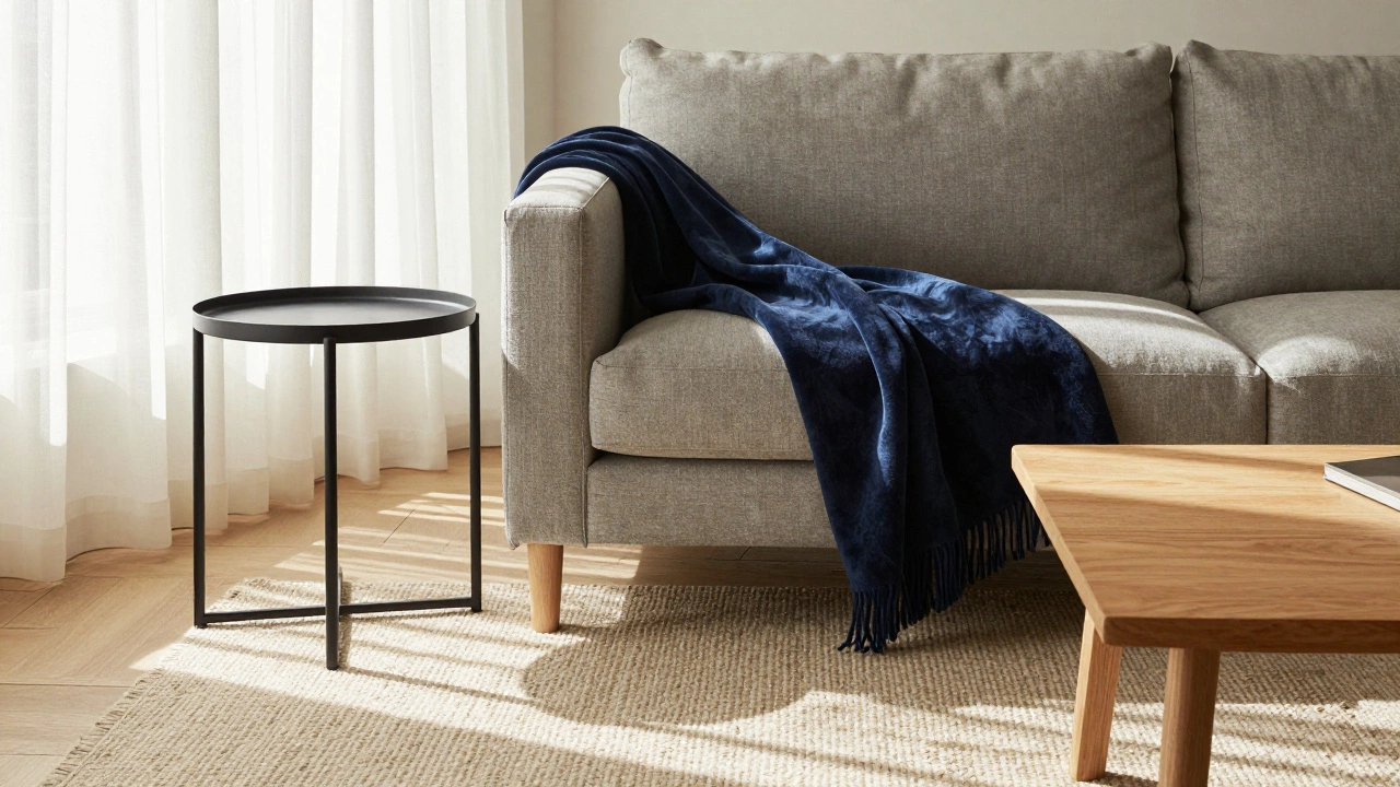
Not all timeless colors are neutral. Deep navy is quietly everywhere-in designer showrooms, boutique hotels, and homes that want to feel calm but sophisticated. A navy velvet armchair doesn’t shout. It whispers luxury. It works with gold accents, white walls, and even gray carpets. And unlike brighter blues, navy doesn’t fade under sunlight.
Why does navy work? It’s a mood. It’s the color of a midnight sky, a well-worn denim jacket, or a classic navy blazer. It’s not a trend-it’s a staple. In Melbourne, where winters are long and gray, a navy sofa becomes a cozy anchor. Pair it with cream throws and wooden side tables, and you’ve got a look that feels lived-in, not staged.
What Colors Should You Avoid?
Not all colors age well. Bright, saturated hues like neon green, electric yellow, or hot pink are fun for a few years-but they become hard to live with. The same goes for overly trendy wood stains, like gray-washed oak (which was everywhere in 2015-2020). Now, many homeowners are stripping it off to reveal the natural wood underneath.
Also avoid furniture with overly specific design cues. Think: tufted Chesterfields in pastel pink, or mid-century modern pieces with chrome legs in a room full of rustic wood. These look intentional at first, but they tie you to a moment in time. Timeless furniture doesn’t scream its style-it whispers it.
How to Test a Color Before You Buy
Don’t just grab a swatch and go. Bring home a fabric sample or a small piece. Live with it for a week. Move it around the room. See how it looks in morning light, afternoon sun, and evening lamplight. Does it feel calm? Or does it feel loud? Does it blend, or does it fight?
Try this: place your potential piece next to a white sheet of paper. If it looks dull, it’s probably too muted. If it looks too bold, it might overwhelm. The sweet spot is a color that feels like it belongs-like it was always meant to be there.
Final Rule: Match the Material, Not Just the Hue
Timeless furniture isn’t about color alone-it’s about quality. A cheap, glossy white veneer will chip and yellow. A solid oak table with a hand-rubbed oil finish will last generations. The same goes for fabric: linen and wool breathe, fade slowly, and soften with use. Polyester and vinyl look new for a while, then start to shine and crack.
When you choose a color, also ask: What is it made of? If the answer is “MDF with a printed wood grain,” walk away. If it’s “solid ash with natural oil finish,” you’re on the right track. The best timeless colors are backed by honest materials.
So, what color furniture is timeless? It’s not one shade. It’s a mindset: choose quality, choose neutrality with warmth, choose texture over trend. The pieces that last aren’t the ones that caught your eye in a catalog. They’re the ones that feel like home-long after the trend has passed.
Is white furniture really timeless, or does it just look clean?
White furniture can be timeless, but only if it’s made from natural materials like linen, cotton, or untreated wood. Glossy white plastic or particleboard will yellow and look cheap over time. Real white furniture ages gracefully-linen softens, wood develops a patina, and the color becomes part of the room’s history, not just its look.
What’s the best neutral for small spaces?
Greige is the top choice for small spaces. It’s warm enough to feel inviting, but cool enough to make rooms feel larger. It reflects light better than dark tones and doesn’t shrink the space like black might. In Melbourne apartments, greige sofas and side tables are common because they work with both natural light and artificial lighting without overwhelming.
Can dark furniture work in a bright room?
Absolutely. Dark furniture in a bright room creates balance. Think of it like a black t-shirt with white jeans-it grounds the space. A dark walnut dining table in a sunlit kitchen feels intentional, not heavy. The key is contrast: pair dark pieces with light walls, sheer curtains, or metallic accents to keep the room from feeling closed in.
Do timeless furniture colors work with modern decor?
Yes, because timeless colors are neutral by nature. A navy sofa or a greige armchair fits right into minimalist, industrial, or Scandinavian styles. The modern look doesn’t rely on color-it relies on form, texture, and space. Timeless furniture gives you a calm foundation so your clean lines and simple shapes can shine.
Should I buy all my furniture in the same color?
No, and you shouldn’t. Timeless interiors use variation within a tonal family. Pair a greige sofa with a walnut coffee table and a black metal lamp. The colors are related, not identical. This creates depth without chaos. Matching everything looks staged. Harmonizing looks lived-in-and that’s what lasts.