 26
Oct,2026
Home Paint Value Estimator
Select the primary color palette you plan to use for key areas of your home to estimate the potential impact on resale value.
Estimated Total Value Impact
Recommendation Summary:
- Select a color option above to see specific recommendations.
You’re staring at a swatch of "Sea Salt" or "Chantilly Lace," wondering if picking the wrong shade could cost you thousands when you finally list your place. It’s a valid fear. Paint is one of the cheapest upgrades you can make, but it’s also one of the most visible. If you get it right, buyers walk in and feel an instant connection. If you get it wrong, they see a red flag-or worse, just a room that feels off.
Here is the blunt truth: there isn’t one magic color that makes every house worth more. But data from real estate listings, appraisal reports, and renovation studies tells us exactly which hues move the needle. Whether you are repainting your living room for comfort or prepping your facade for sale, knowing what adds value saves you money and stress.
The Short Answer: What Buyers Actually Want
Neutral palettes consistently add the most measurable value to a home across almost all markets. Specifically, warm whites, soft grays, and earthy beiges dominate high-value listings. Why? Because they act as a blank canvas. They allow potential buyers to project their own furniture and life into the space without fighting against your personal taste. According to Zillow’s annual paint color analysis, homes with white or light gray kitchens sold for up to $3,400 more than expected, while blue bathrooms fetched nearly $5,000 above average estimates in certain regions.
But don’t stop at "white." Not all whites are created equal. A stark, hospital-white can make a cozy Melbourne bungalow feel cold and clinical. The value-add comes from warmth. Think creamy off-whites like Benjamin Moore’s "Swiss Coffee" or Sherwin-Williams’ "Alabaster." These tones reflect natural light beautifully, making rooms appear larger and cleaner-two things every buyer pays a premium for.
Exterior Curb Appeal: The First Impression Money Maker
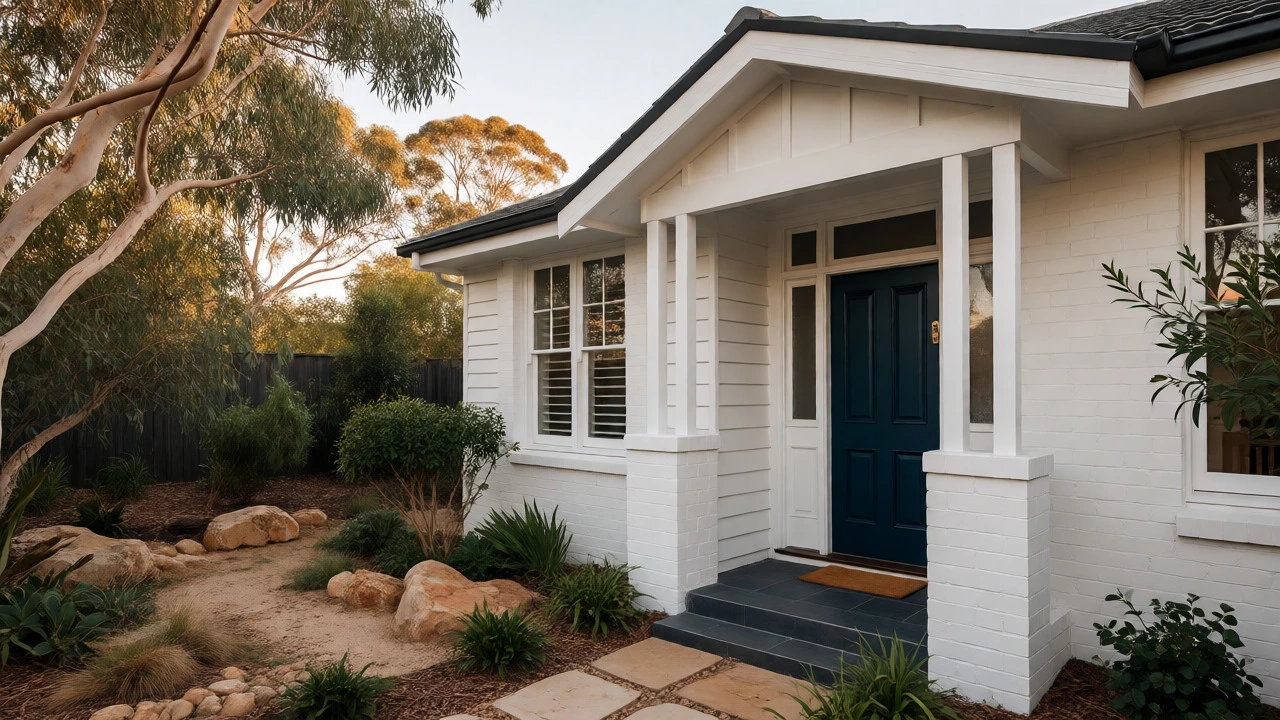
Before anyone sees your kitchen backsplash, they judge your curb appeal. And here, color psychology plays a huge role. A study by Farrow & Ball and various real estate agents suggests that dark exteriors often signal quality and maintenance. Black, charcoal, or deep navy front doors paired with crisp white trim create a sharp, modern contrast that photographs incredibly well.
If your siding or brick is dated, painting it can yield a massive return on investment (ROI). Lighter shades generally perform better for resale because they hide dirt less visibly than mid-tone grays, but dark accents on shutters or doors add character. In suburban areas, sticking to traditional neutrals for the main body of the house and using a bold accent color only on the front door is the safest bet for maximum valuation. A bright red door might express your personality, but a sophisticated slate blue or forest green appeals to a broader demographic, widening your pool of potential buyers.
Kitchens and Bathrooms: Where Color Hits the Wallet Hardest
Kitchens sell houses. Period. And the color of your cabinets matters more than you think. For years, dark wood stains dominated, but current market data shows a strong preference for lighter cabinetry. White shaker-style cabinets remain the gold standard for ROI. They look clean, timeless, and expensive, even if you used budget-friendly stock units.
However, if white feels too sterile, consider two-tone kitchens. Painting lower cabinets a darker shade (like navy or charcoal) while keeping upper cabinets white creates visual interest without overwhelming the space. This trend has held steady for several years and continues to command attention in listing photos. Avoid trendy, saturated colors like avocado green or burnt orange unless you plan to live there forever. Those colors date quickly and force new owners to repaint immediately, which lowers their willingness to pay top dollar.
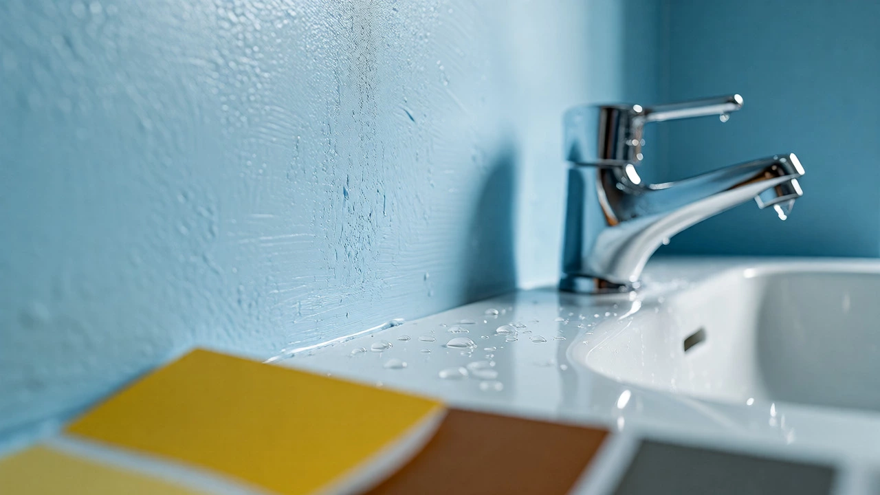
Bathrooms follow similar logic. Soft blues and greens evoke a spa-like serenity, which taps into the buyer’s desire for relaxation. Zillow’s data highlights that pale blue bathrooms can increase sale price by roughly 5% compared to homes with yellow or brown bathrooms. It’s not just about aesthetics; it’s about perceived cleanliness. Blue and green are associated with water and hygiene, subconsciously signaling to buyers that the wet areas are fresh and well-maintained.
Living Spaces: Creating Flow and Perceived Space
In open-plan living areas, continuity is key. If you have distinct zones-say, a dining area flowing into a lounge-using different colors can chop up the space visually, making it feel smaller. Smaller square footage translates to lower appraised value in many markets. To maximize value, use a single cohesive neutral tone throughout connected spaces. This technique blurs boundaries and enhances the sense of volume.
Greige-a blend of gray and beige-is currently the MVP of living room colors. It offers the sophistication of gray without the coldness, combined with the warmth of beige. It pairs effortlessly with timber floors, marble countertops, and metallic fixtures. Because it is so versatile, it doesn’t clash with whatever furniture the next owner brings in. This flexibility is a tangible asset. When a buyer thinks, "I can keep my sofa," they are less likely to negotiate down the price to cover renovation costs.
Regional Nuances: The Australian Context
While global trends point toward neutrals, local climate influences matter. In Australia, particularly in places like Melbourne, natural light varies significantly between winter and summer. Cool-toned whites can turn bluish and gloomy on overcast days, making interiors feel uninviting. Warm undertones counteract this, adding psychological warmth during colder months.
Additionally, Australian homes often feature indoor-outdoor living flows. Exterior colors should complement the surrounding landscape rather than fight it. Earthy tones-sandy beiges, muted greens, and stone grays-blend seamlessly with native gardens and bushland settings common in many suburbs. This harmony between inside and outside boosts the perceived lifestyle value of the property, a factor that savvy buyers weigh heavily.
Comparison: High-Value vs. Low-Value Colors
To help you decide, let’s break down specific hues based on their impact on resale value and broad appeal. Note that these values are generalizations based on aggregate market data and may vary by location and property type.
| Color Family | Perceived Value Impact | Best Application | Risk Level |
|---|---|---|---|
| Warm White / Cream | High (+$1k - $3k) | Ceilings, Walls, Cabinets | Low |
| Soft Gray / Greige | Medium-High (+$1k - $2k) | Living Areas, Hallways | Low |
| Pale Blue | Medium (+$500 - $1.5k) | Bathrooms, Bedrooms | Low-Medium |
| Navy / Charcoal | Variable (Depends on execution) | Front Doors, Accent Walls | Medium |
| Yellow / Orange | Low to Negative | Kids' Rooms, Sunrooms | High |
| Dark Red / Brown | Negative | Dining Rooms (dated) | High |
Common Pitfalls That Kill Value
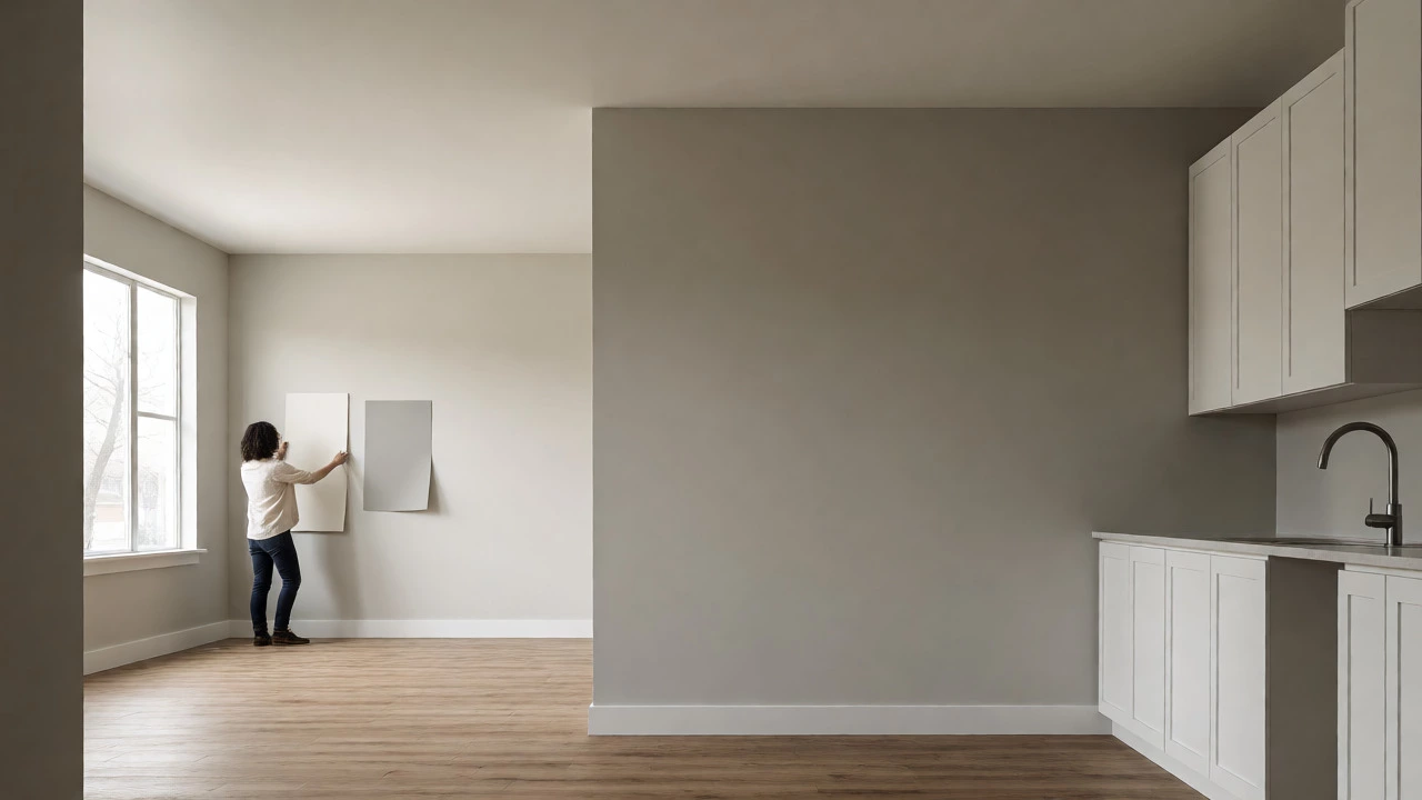
Even with the right palette, mistakes happen. One major error is ignoring lighting. A paint chip looks different under store lights than it does in your hallway. Always buy sample pots and paint large patches on multiple walls. Observe them at morning, noon, and night. If the color shifts drastically or looks muddy, discard it.
Another trap is mismatched finishes. Mixing satin and eggshell incorrectly can highlight wall imperfections. Generally, higher sheen reflects more light but reveals flaws. Use flat or matte for ceilings and low-traffic walls to hide bumps, and semi-gloss for trims and doors to withstand cleaning. Consistency in finish signals professionalism and care, subtly boosting the buyer’s confidence in the home’s condition.
Finally, don’t neglect the power of decluttering before painting. A small, cluttered room painted in a perfect neutral still feels cramped. Remove excess furniture and decor to let the color breathe. The goal is to showcase the architecture and the light, not to compete with your collection of knick-knacks.
Frequently Asked Questions
Does painting the entire house white really increase its value?
Not necessarily the entire house, but using white or very light neutrals in key areas like kitchens, living rooms, and hallways definitely helps. White reflects light, making spaces feel larger and cleaner, which appeals to the majority of buyers. However, avoid stark, cool whites in older homes with poor insulation, as they can feel cold. Warm whites are usually safer and more inviting.
What is the best color for a front door to boost curb appeal?
Semi-gloss black, navy blue, or forest green are top performers. These colors provide a strong contrast against most siding materials (brick, weatherboard, or stucco) and look expensive in listing photos. Avoid primary red or bright yellow, as they can appear tacky or dated to some buyers, potentially narrowing your market.
Should I match my interior and exterior paint colors?
They don’t need to match exactly, but they should coordinate. If your exterior is a warm sandstone color, choose interior whites with warm undertones (yellow/red) rather than cool ones (blue/green). This creates a harmonious flow from outside to inside, enhancing the overall aesthetic coherence of the property.
Do trendy colors hurt resale value?
Yes, highly saturated or niche trendy colors can hurt resale value. While they might look great now, they polarize buyers. Someone who loves sage green might hate terracotta. Neutral colors have universal appeal, ensuring you don’t lose potential buyers who simply dislike your specific hue. Save the bold trends for throw pillows and art, which are easy to change.
How much does professional painting cost versus DIY?
Professional painting ensures smooth lines, proper prep, and durable finishes, which buyers notice. DIY saves labor costs but risks uneven application or missed spots. For high-visibility areas like living rooms and exteriors, hiring a pro is often worth the investment to ensure a flawless finish that supports a higher asking price.